Discover deviations from expected behavior detected by TSI's anomaly detection using the Insights Dashboard. Review the Insights dashboard at the start of your day or shift to uncover excursions or process deviations in your daily operations.
Using the Dashboard
Select a tree that you would like to review using the dropdown menu on the navigation drawer. Typically, this would be the tree which organizes the main items in your operations, such as assets or services.

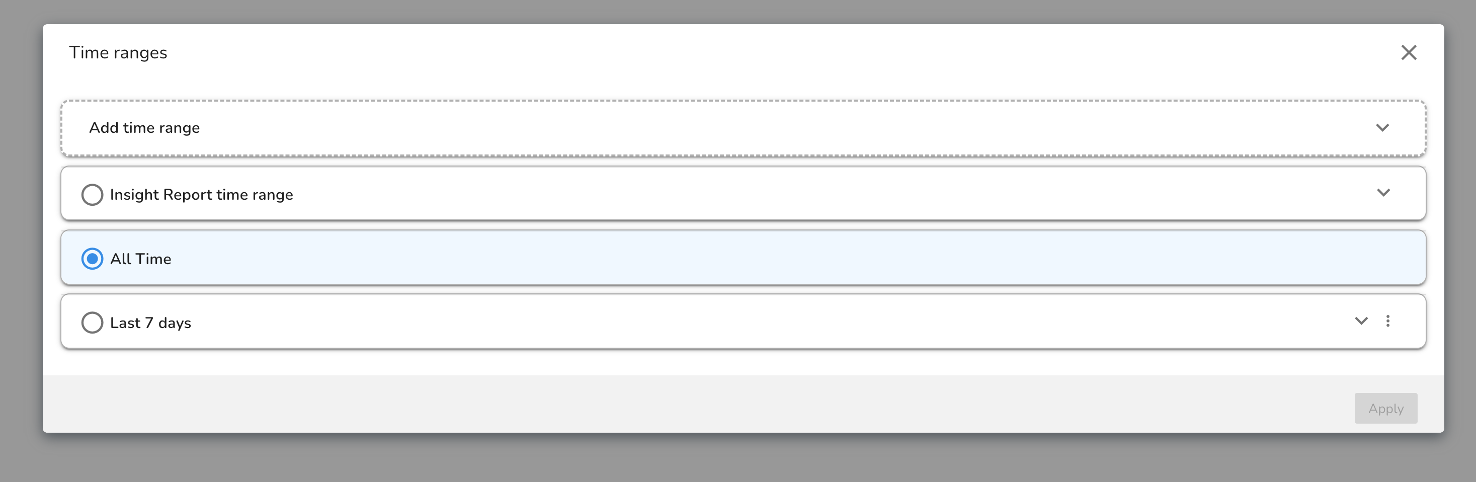
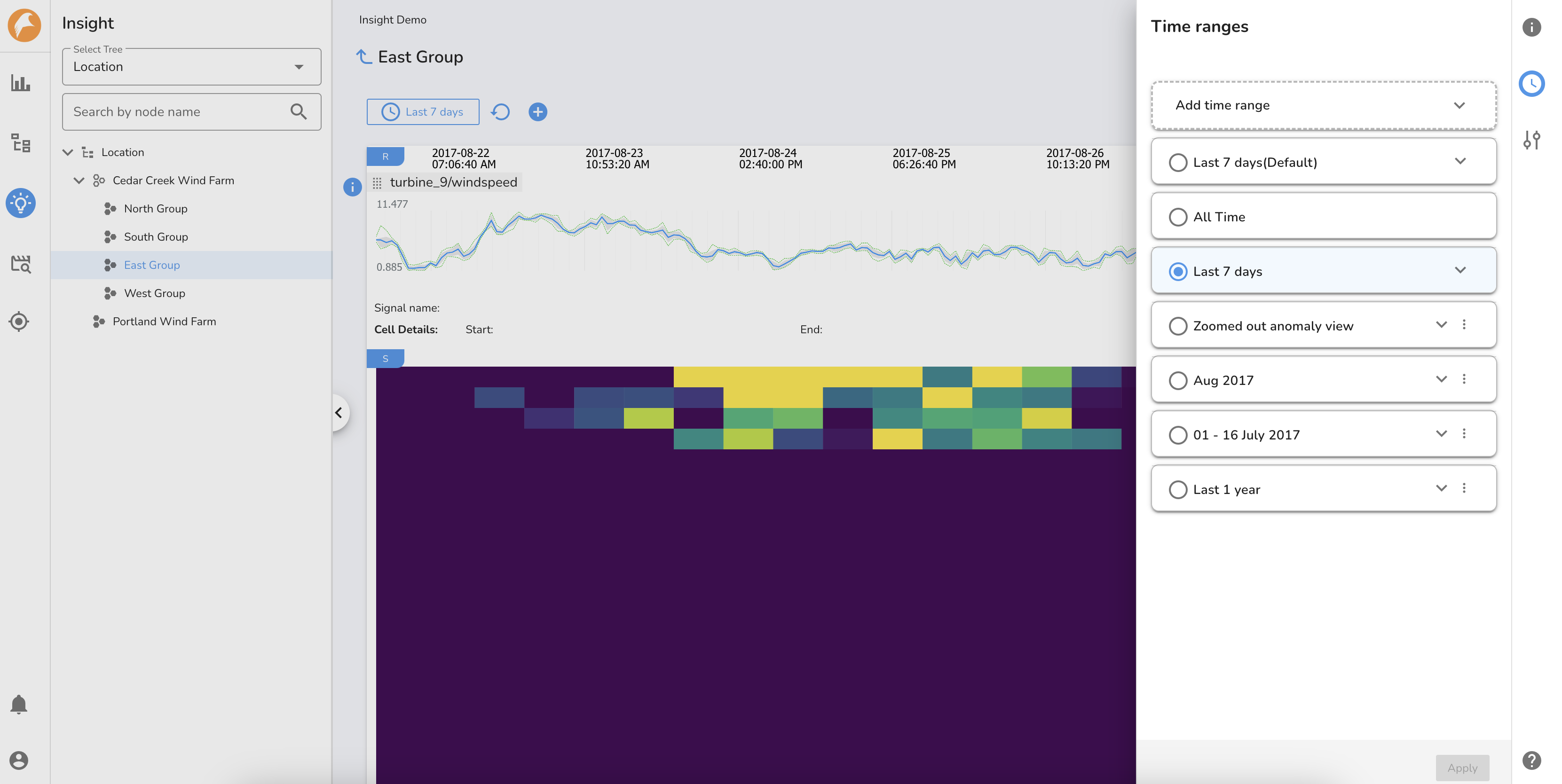
Next, expand the tree and navigate to the node of interest to review the heatmap of the assigned signals. The default time range of the Insights dashboard is to set to the Last 7 days. Additional time ranges can be created and viewed using the the Time range Manager.
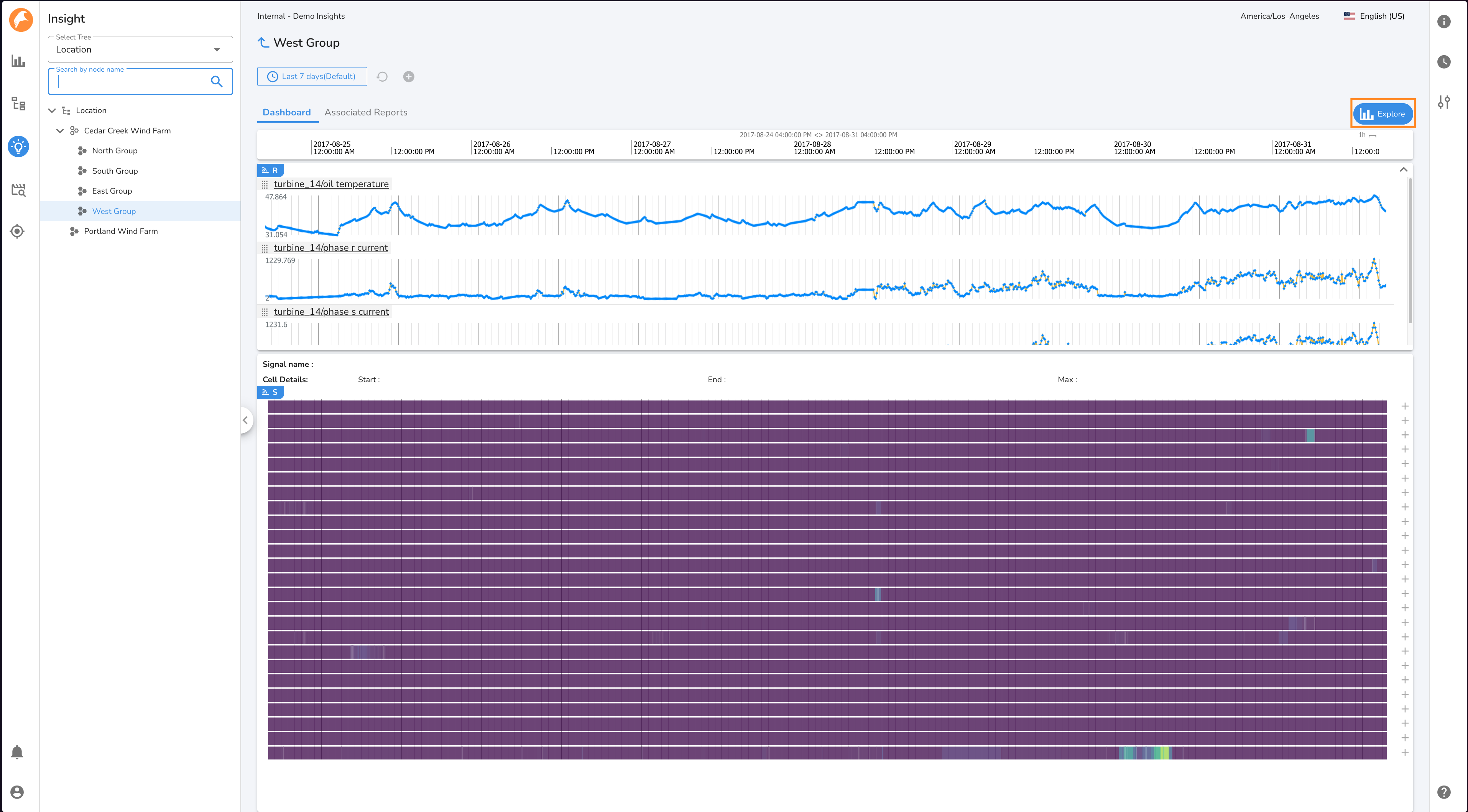
The Insights dashboard consists of two sections:
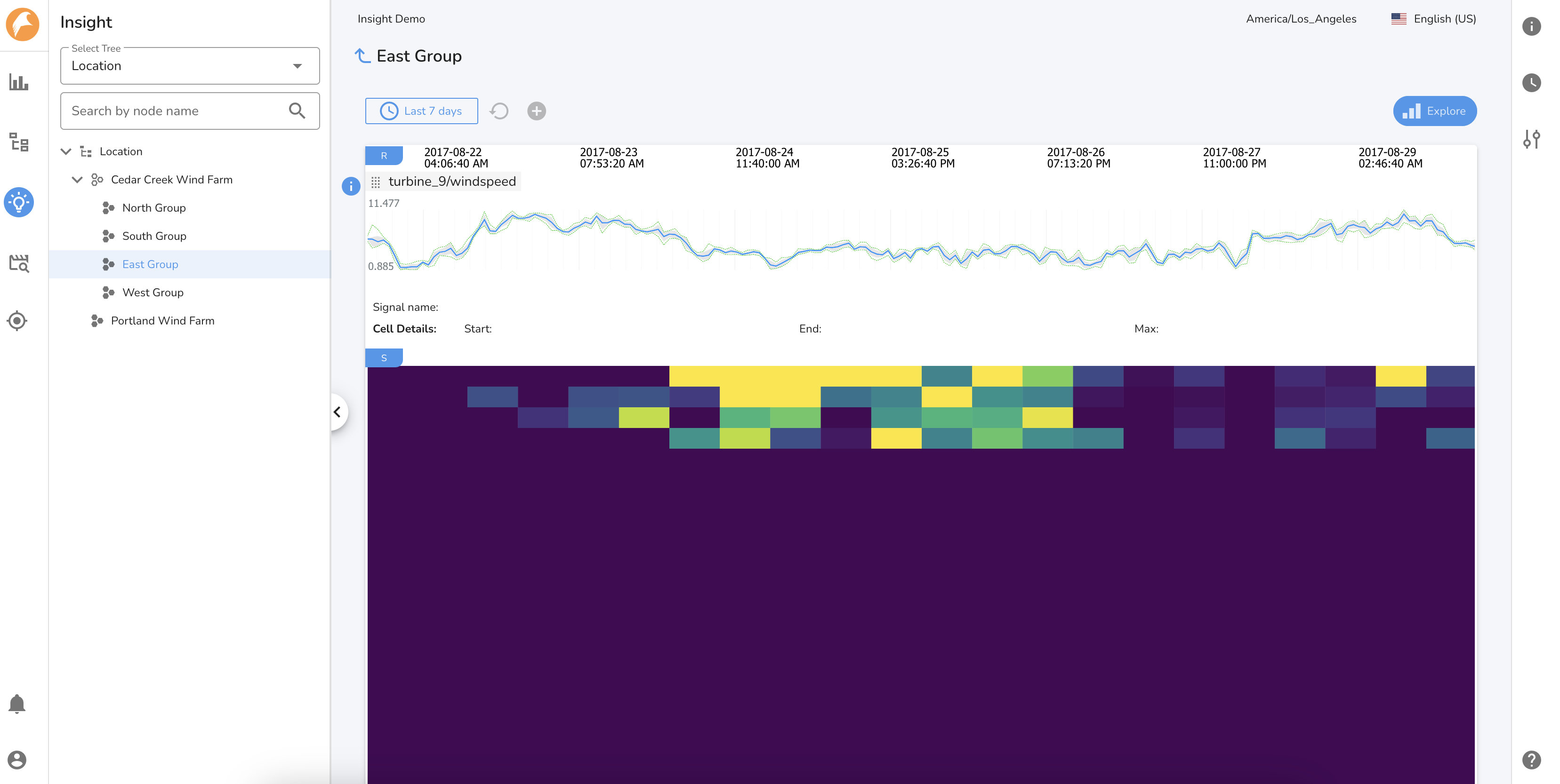
1. Heatmap view of the signals assigned to the node
The Insights heatmap, by default, selects the first 500 signals assigned to the node. The heatmap represents behaviors of the signals that are deviating from normal/expected operation or those that have never been observed previously. The "Score" represents the degree or severity of deviation from expected behavior for the signal.
- Scores denoted with purple color are considered normal operations that do not require attention.
- Scores denoted with a color gradient from green to yellow represent varying degrees of unexpected behavior worthy of further investigation.
- Scores denoted with yellow color represent significant deviations from expected behavior requiring immediate and timely attention. In some cases, this may also indicate a behavior that was not captured in the original learning period, and will be captured by subsequent incremental learning.
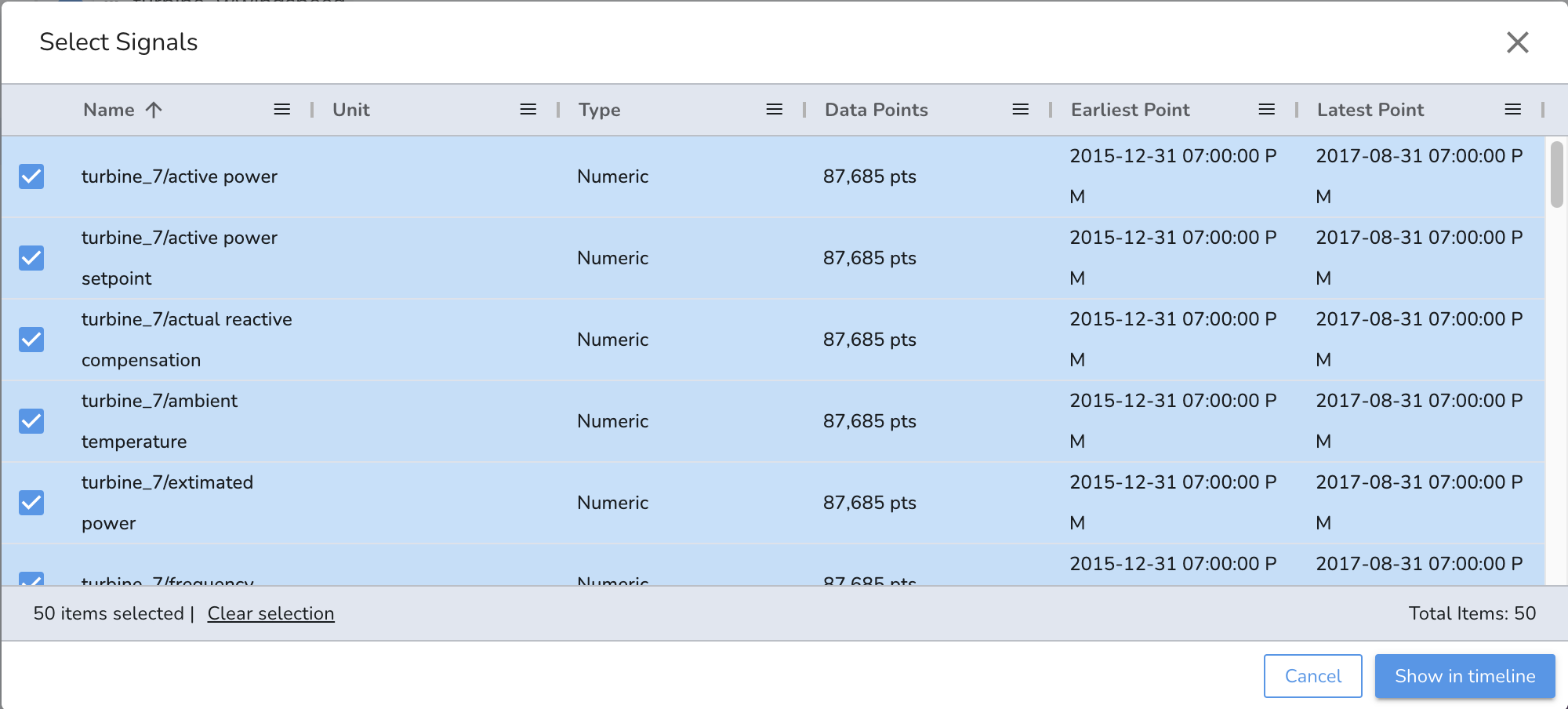
Clicking on the heatmap displays the name of the affected signal along with the max score for the selected cell duration. Add/remove signals from the heatmap view by clicking on the \"S\" button.

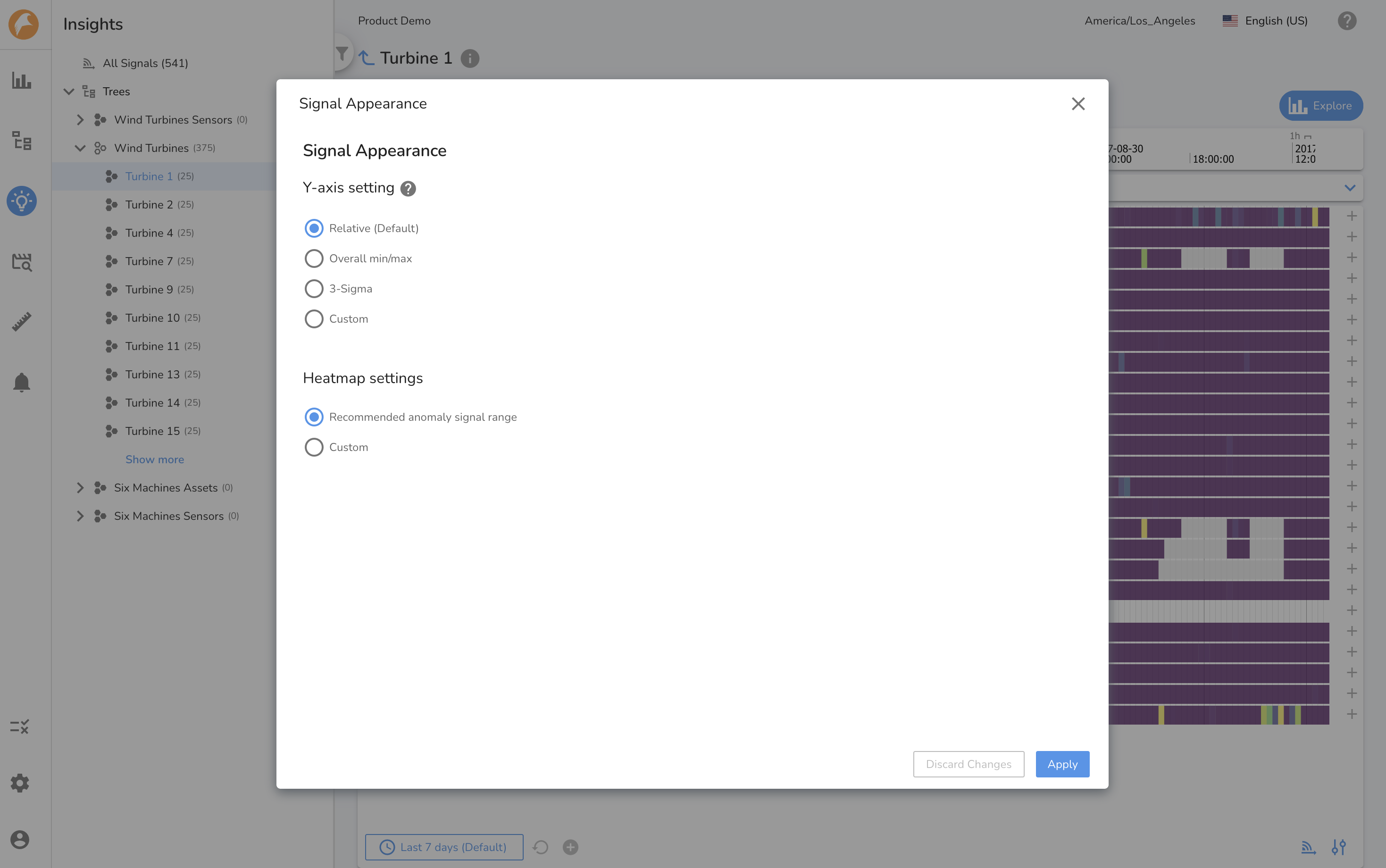
By clicking on the Signal Appearance button, the y-axis and heatmap settings can be changed using the available options.
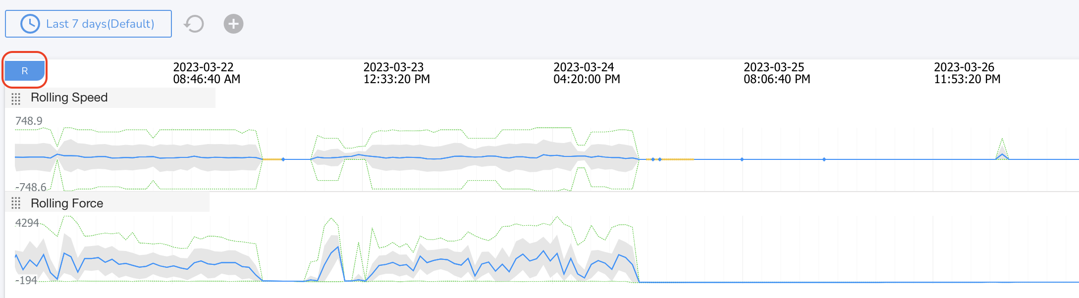
2. Reference signals
Add reference signals from any tree node by clicking on the \"R\" button to understand the context of operations during the selected time period.
Creating an Insights Report
Once the anomalous behavior has been reviewed and if further investigation is warranted, click on the \"Explore\" button to understand the behavior further by creating comparisons charts and documenting the analysis and findings.
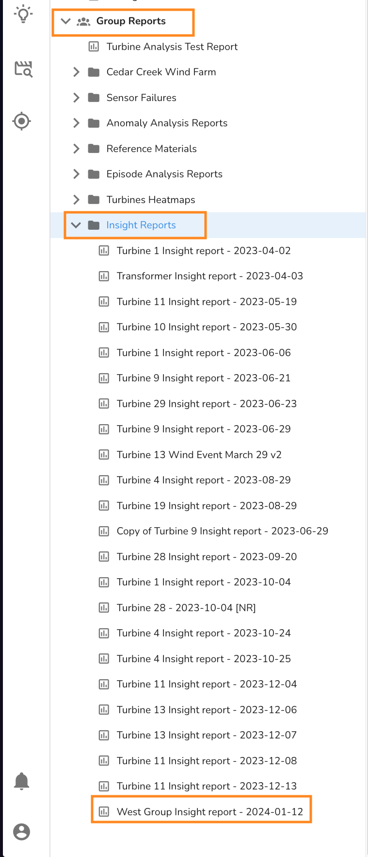
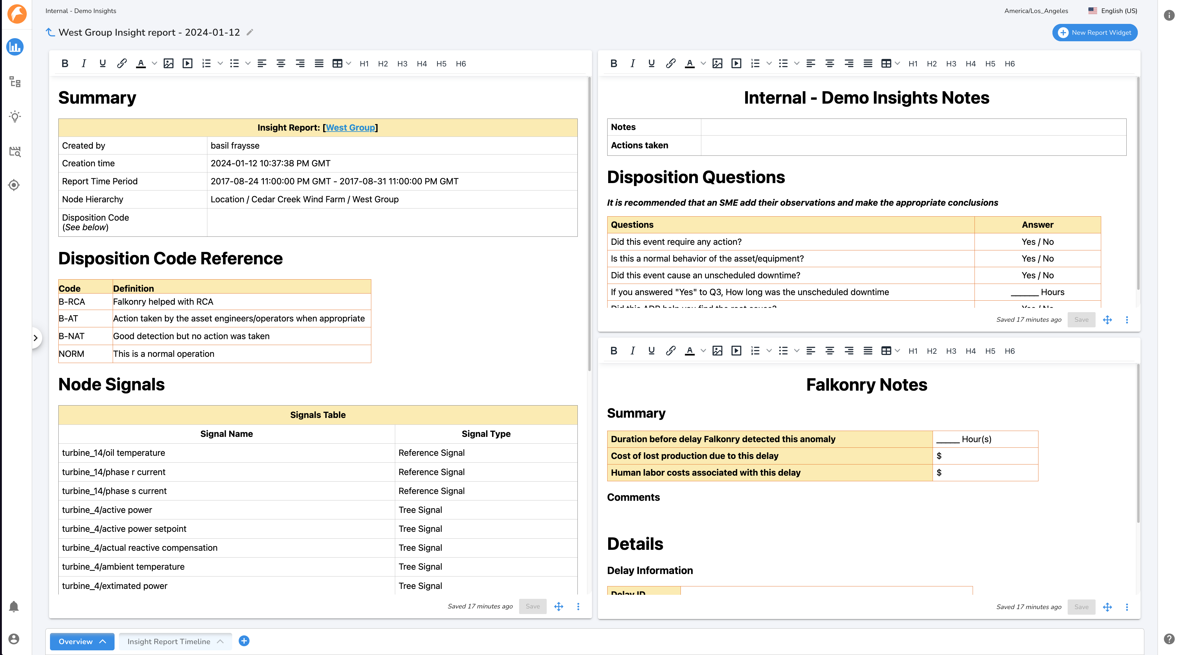
The Insights report will be saved in the Group Reports folder with the name \"[Tree Node Name] Insights report [report creation date]\". An Insights Report can managed and edited as any other report.
An Insights Report will have a default tab with the same reference and tree node signals as displayed in Insights when the Explore button was clicked. The tree node signals will be displayed in the same manner as in Insights, either as a Heatmap, or as a Line Chart with the Insights assessment overlayed. The default tab is read-only and cannot be edited to keep a record of what was being viewed in Insights at the time the report was created. New tabs can be created to continue analysis.
The Insights Report will be preconfigured with the time range matching the time period on display in Insights. This time range will be avialable in the Time Period Manager.