Insights Dashboard
The Insights Dashboard in Falkonry TSI is a key interface for automatically discovering deviations from expected operational behavior detected by Falkonry's anomaly detection engine. It serves as a visual tool for engineers and operators to review and prioritize unusual activity in their data.
Benefits
- It allows users to quickly identify excursions or process deviations in their daily operations, often reviewed at the start of a day or shift.
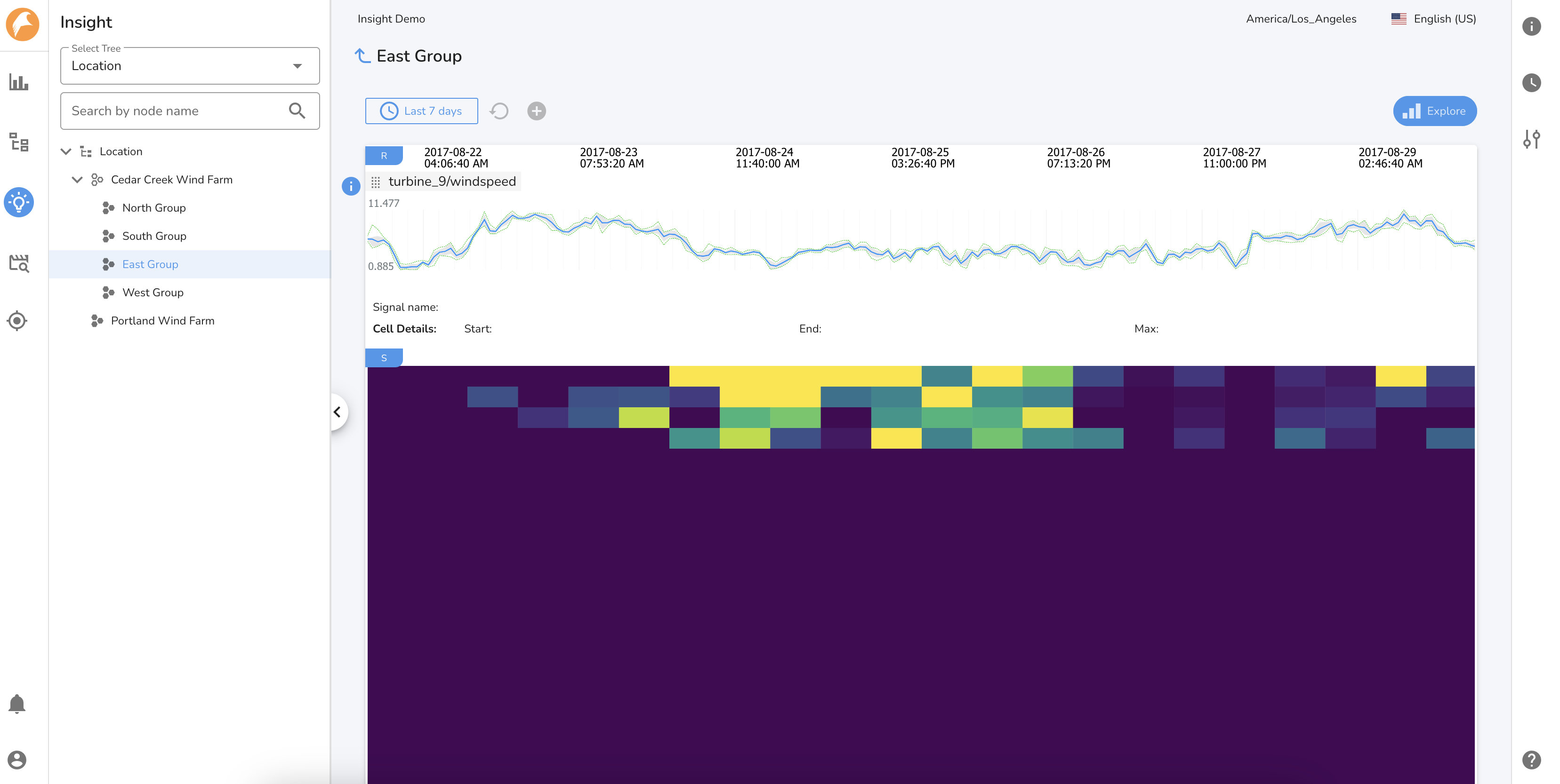
- The core of the Insights Dashboard is the anomaly heatmap, which visually highlights anomalous signal behavior over a selected time range. It is recommended to focus on the most recent 24 hours to assess current system conditions effectively.
- The heatmap displays the "Score," which represents the degree or severity of deviation from expected behavior for each signal.
- Signals displayed on the Insights Dashboard are organized into trees (e.g., based on assets or services), allowing users to navigate to specific nodes of interest. Users can also add "reference signals" from any tree node to understand the operational context of anomalies.
The Insights Dashboard provides a crucial first step in monitoring Falkonry AI outputs, guiding users to discover and prioritize issues before proceeding to deeper analysis and action.
Using the Dashboard
Select a tree/node of choice to review the bird's eye heatmap view of the operation. By default, the Insights Dashboard displays data from the last 7 days. You can define and switch to other time ranges using the Time Range Manager.
The Insights dashboard consists of two sections:
1. Reference signals
Add reference signals from any tree node by clicking on the button to understand the context of operations during the selected time period.
2. Heatmap View
The Insights heatmap highlights deviations from normal behavior using color-coded scores:
- Purple = normal,
- Green to Yellow = rising anomaly severity,
- Yellow = significant or novel behavior needing attention.
By default, it shows the past 7 days and the first 25 signals of a node. Users may adjust the time range and generate an "Insights Report" via the Explore button for deeper analysis.
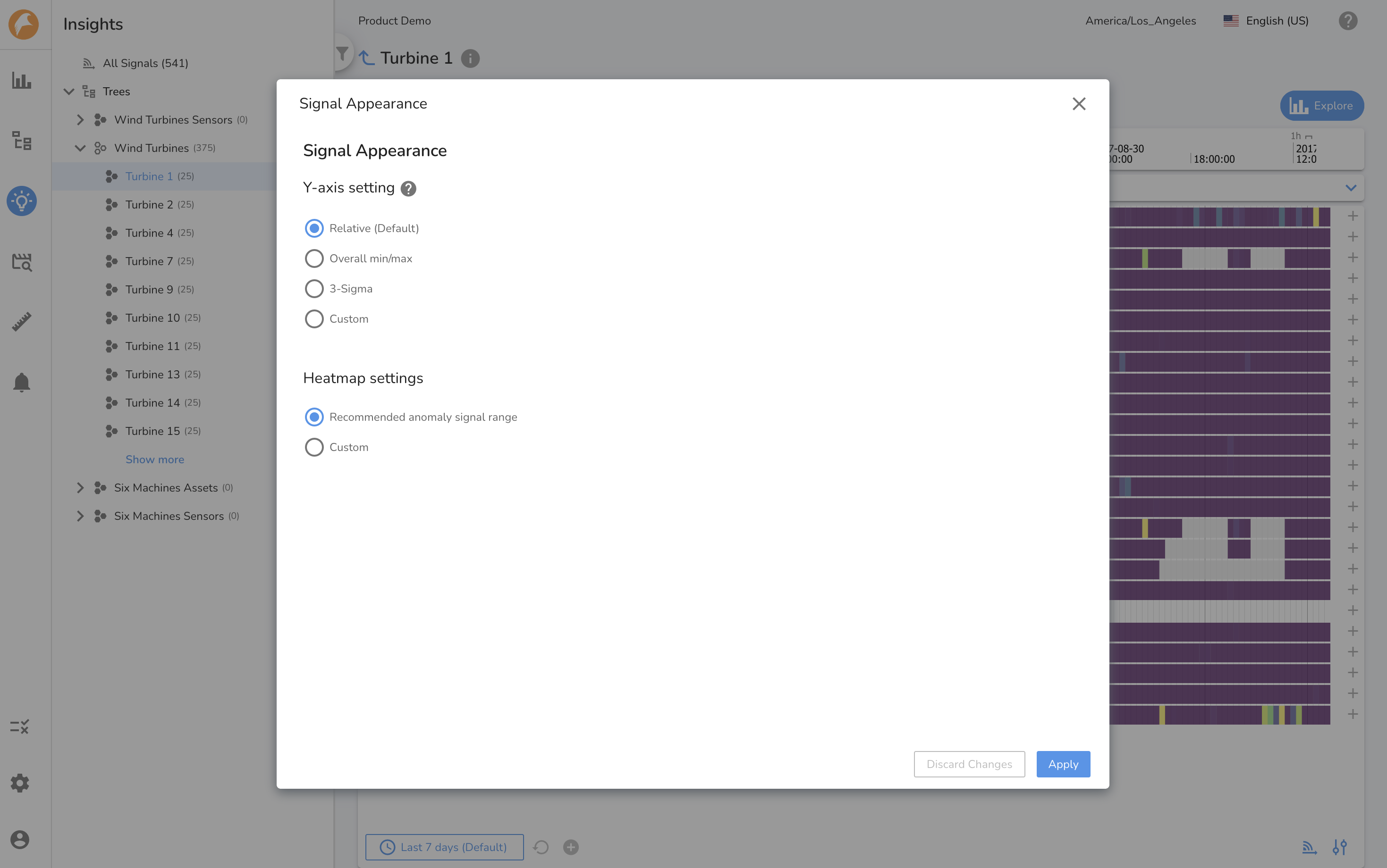
It is possible to adjust the heatmap color spectrum from Signal Appearances by defining the custom range for anomal score signals (or anomaly signal range). By default, Falkonry TSI considers anomaly scores of 3 or lower as normal, helping to fine-tune what’s visually highlighted as abnormal behavior.
Creating an Insights Report
When anomalous behavior is observed and merits further investigation, an Insights Report helps structure and document the analysis. It enables side-by-side comparison of signals, tracking of patterns, and sharing of findings within the team.
The report captures the context of the investigation — preserving the same signals, reference data, and time period that were under review. This ensures consistency and makes it easier to revisit or extend the analysis at a later stage. While the original view is retained as a reference, additional analysis can be continued through editable tabs within the report.
Insights Reports are centrally stored for collaboration and follow-up, making them a powerful tool for turning observed anomalies into actionable intelligence.