Signals Overview
A Signal is the fundamental logical unit of time series data in Falkonry TSI. For example, readings from each sensor in a system are captured as signals. Falkonry TSI processes and analyzes time series data, which includes both User-provided signals and Falkonry generated signals. These signals are primarily of two types - Numeric and Categorical
Key Recommendations
- Design signal names to be uniquely identified and human-understandable.
- Keep descriptions short and human-understandable.
- Identify the correct data type before approving signals and processing data.
- Use a high sampling rate (e.g., 1 Hz).
- Maintain a consistent sampling rate within a signal.
- Include upper and lower level limits (min/max thresholds).
Numeric Signals
In order to view high-frequency data over extended periods of time, graphs do not always display every raw data point. Instead, when zoomed out, numeric signals show aggregate information about the raw data rendered as line charts wherein each signal has 5 lines. This helps the user understand the underlying signal data even when the individual data points cannot be resolved at the current level of zoom. The figure below explains the meaning of these lines:
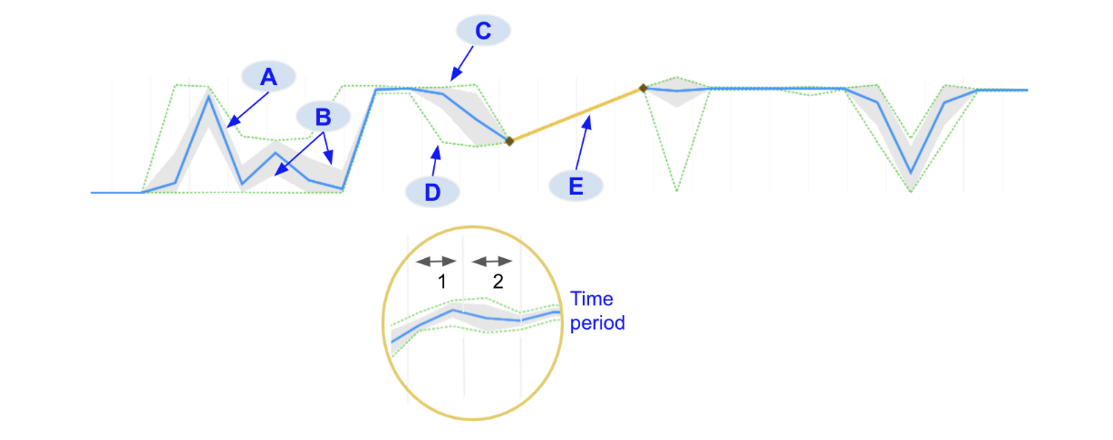
A. Mean: The blue line indicates the average value for all signal data points in that time period
B. Standard deviation (+1σ and -1σ): The filled gray region around the mean indicates the standard deviation of all signal data point values in that time period
C. Max: The upper green dotted line indicates the maximum value for all signal data points in that time period
D. Min: The lower green dotted line indicates the minimum value for all signal data points in that time period.
E. Gap: When there is a region of missing values in the data, the system connects the two data points on either side of the gap with a yellow line
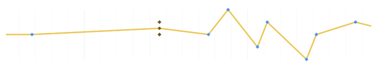
The time period over which these statistics are calculated will be shown in the numerical data caption. When a user zooms in far enough the raw data points will appear, designated with blue diamond markers.
Sometimes, when zoomed in, there may be regions in the data where there is more than 1 data point in a time period. The values of these points are aggregated and are shown in brown color.
Categorical Signals
Categorical signals useful for providing operational context or reference and monitoring value changes over time. Similar to numerical signals, categorical signals will show aggregate statistical information when
zoomed out in order for dense data to be interpreted. This is true for
operational signal data as well as model predictions. When a range of a
categorical signal contains different labels, the colors of those labels
will be shown as barber-pole
( ). Each pole will
have up to 4 different colors, representing 4 different labels. If there
are more than 4 labels that occur in that time range then it will
display the first 3 labels and then \"others\".
). Each pole will
have up to 4 different colors, representing 4 different labels. If there
are more than 4 labels that occur in that time range then it will
display the first 3 labels and then \"others\".
When zoomed in further the raw data will display. Individual categorical data points will display as rectangular markers colored to match the labels they represent.
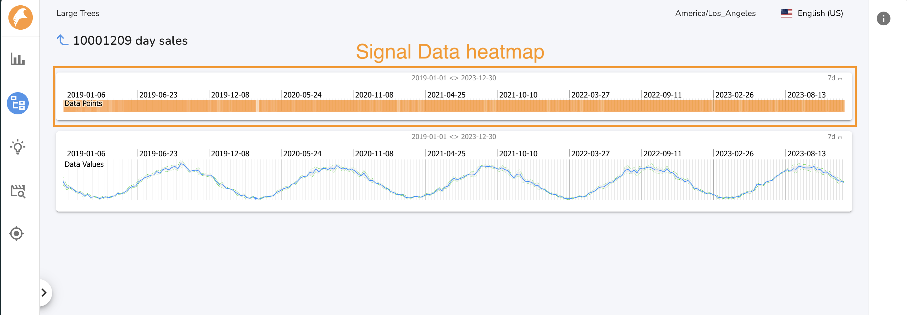
Signal page
The Single Signal Page shows a signal and visualizes the data density for that signal. This is a quick way to determine if Falkonry TSI has been consistently recieveing data for a given signal. To access the Single Signal page for a given signal, click on the signal\'s name on the Signals Tab of the All Signals page or a Tree Node page. Click the back arrow to return to the ALl Signals page. When you navigate to a Single Signal page, a node is displayed in the Navigation Panel under the All Signals node. Up to 10 Single Signal nodes will be displayed.